Liquid cluster
A notification that splits into a card and Clear button through a liquid seam.
Preview
Notification
JoinedControls
Click the notification to reveal Clear. Right-click for more actions.
Installation
bunx shadcn@latest add @modulo/liquid-clusterRequires an active Modulo key and a project configured for shadcn.
Registry setup
Set MODULO_REGISTRY_KEY to your key. Add this registry entry to components.json.
{
  "registries": {
    "@modulo": {
      "url": "<registry-url>/r/{name}.json",
      "headers": {
        "Authorization": "Bearer ${MODULO_REGISTRY_KEY}"
      }
    }
  }
}
Usage
import { LiquidCluster } from "@/components/liquid-cluster/LiquidCluster";

const items = [
  { id: "notification", label: "Open notification", content: <span>Design review is ready.</span> },
  { id: "clear", label: "Clear" },
];

export default function Example() {
  return <LiquidCluster ariaLabel="Notification actions" layout="notification" items={items} defaultSeparation={0} onSelect={id => console.log(id)} />;
}
React and Canvas 2D. All three source files install together. No animation package required.
Registry JSONDownload thumbnailDownload preview GIFDownload preview video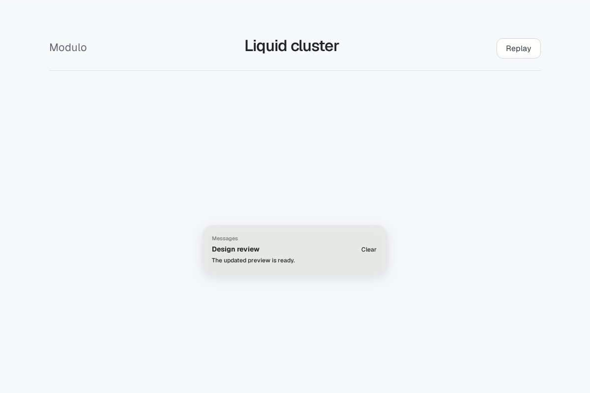
Interaction
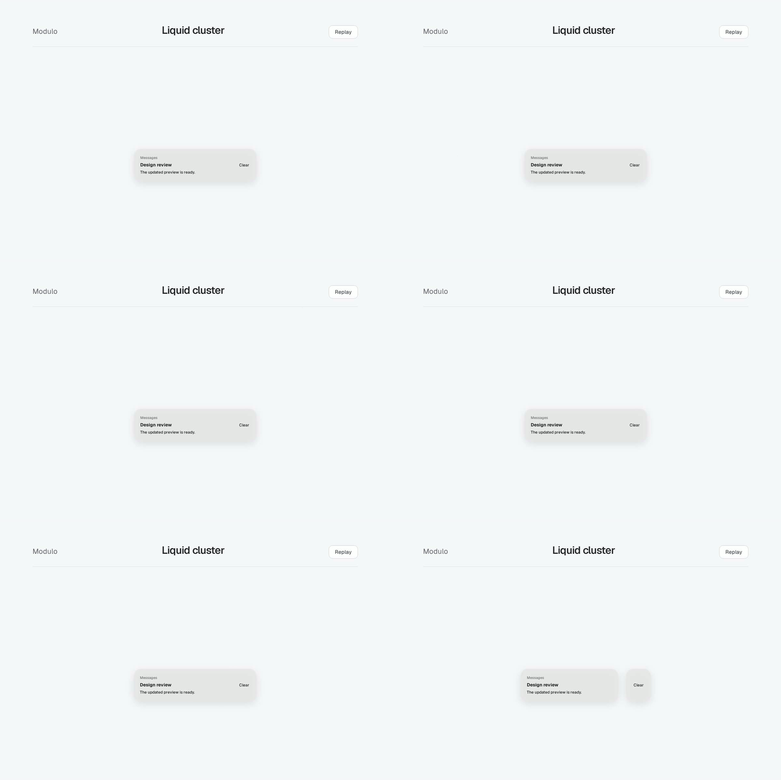
Click the notification, or press Enter or Space, to reveal Clear. Clear dismisses the demo notification. Replay and Reset restore it. Right-click the preview or open the Controls menu for the same actions and preferences.
Notification layout uses two independently operable buttons. At zero separation, their backgrounds form one rectangle. As the gap opens, the inner corners round and a liquid bridge narrows until the card and action separate. Text stays rigid.
Separation ranges from 0 for joined shapes to 1 for separated shapes. Available space determines the gap in pixels. Join and Separate update the same value. A new value retargets the current spring.
Reduced motion applies the final geometry directly. Opaque background removes transparency and the shared shadow. Native buttons remain available if Canvas cannot render or the labels need to wrap.
The background uses geometric smooth-union blending. It is an original adaptation of proximity merging, with no physical fluid simulation or optical refraction.
The default buttons layout also supports ordinary labeled action groups. Supply optional content for a custom card. Handle onSelect in your app to open or dismiss your own notification.
API
| Prop | Type | Default |
|---|---|---|
itemsUnique IDs, accessible labels, optional ReactNode content, and per-item disabled state. Notification layout requires two items. | readonly LiquidClusterItem[] | Required |
layoutNotification starts as one rectangle and separates into a wide card and smaller action. | "buttons" | "notification" | "buttons" |
ariaLabelAccessible name of the related button group. | string | Required |
separation / defaultSeparationNormalized gap from 0 to 1. Controlled separation requires onSeparationChange. | number | 0.65 |
onSeparationChangeRequested normalized separation. | (value: number) => void | Optional |
selectedId / defaultSelectedIdControlled or initial local active button. Controlled selection requires onSelect. | string | null | null |
onSelectIndependent button activation. | (id: string) => void | Optional |
disabledDisables all native button targets. | boolean | false |
opaqueRequests an opaque material adaptation. | boolean | false |
reducedMotionDisables automatic settling. System preference also applies. | boolean | false |
onReadyController on mount and null on cleanup. Keep callback stable. | (controller | null) => void | Optional |
Controller methods
setSeparation(value) requests a normalized value through the same controlled or uncontrolled path. replay() joins then separates the group, or sets the final separated state with reduced motion.
snapshot() reports semantic separation, rendered separation, velocity per second, pixel gap, renderer, preference and lifecycle state. update(options) supplies runtime options. The component calls destroy() on unmount.
Source
Checking source access...